Building Sutra: A Graph-Based Trading Terminal
Every trading app tells you a stock is up 3%. None of them tell you why — and more importantly, what else moves when it does.
ONGC goes up. Is that because crude is up? Because RBI cut rates and banks are lending more to PSUs? Because the whole Nifty Energy sector is rotating? Knowing the number is useless if you don't know the cause.
That gap is what I built Sutra to close.
What It Is
Sutra is a personal trading terminal that maps a watchlist as a relationship graph instead of a list of tickers.
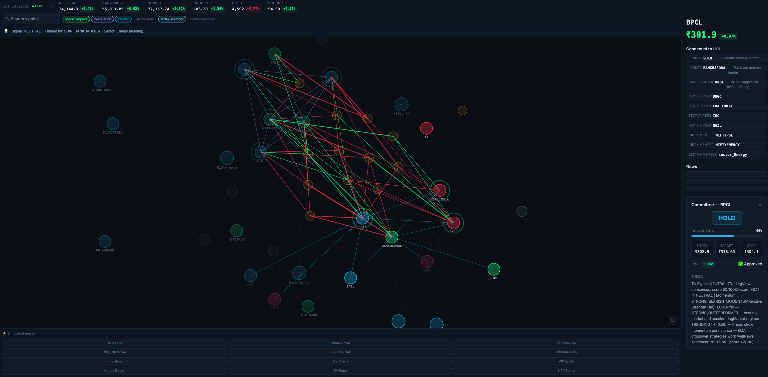
Every stock is a node. But so are macro events (RBI rate decisions, crude oil moves, US Fed policy), market indices (Nifty 50, BankNifty, Nifty PSE), and sectors with momentum indicators.
The edges between them represent real relationships:
- Macro impact — which direction a stock moves when an event fires (green = rises, red = falls)
- Lending — which banks fund which companies
- Correlation — stocks that historically move together
- Index / Sector membership
When you click ONGC, you immediately see: it rises with crude, falls when the rupee weakens, is funded by SBI, moves with BPCL and IOC, and belongs to a currently-leading energy sector. That's the why.
The Graph Problem
The hardest part wasn't the data — it was making the graph readable.
A naive force layout with 46 nodes and 160+ edges looks like a bowl of spaghetti. I went through a few iterations before landing on type-aware radial forces: indices and sectors get pushed to an outer ring, macro events to a middle ring, stocks float in the centre pulled only by their actual relationships.
Hiding structural edges (sector peers, sector membership) by default removed ~80 edges from the initial view without losing any signal. The result: stocks cluster around the macro events that drive them, banks form a tight group, and PSU energy stocks sit near the crude oil node.
It Ticks
This isn't a static diagram — it's a live terminal:
- Prices update every 30 seconds with flash animations on the nodes (green for up, red for down)
- The top bar shows a live IST clock with a pulsing
LIVEindicator during market hours - The portfolio strip shows real P&L on every holding in real time
- Hovering any node shows a tooltip: price, % change, signal, sector momentum
- The right panel shows market breadth — stocks up vs down — as a quick pulse check
Simulating Events
One of the more useful features: you can fire a macro event and see its blast radius on the graph.

Hit "Crude Up" and every node connected to that event highlights — stocks that benefit glow green, stocks that get hurt fade red. It's a quick way to stress-test a portfolio against a scenario before it happens.
The AI Committee
Behind the graph is a 5-agent committee that reviews any stock on demand:
- Research agent — price history, fundamentals, recent news
- Quant agent — RSI, moving averages, momentum signals
- Sentiment agent — reads recent headlines
- Senior analyst — synthesises all three into a verdict (STRONG BUY → STRONG SELL) with a written thesis
- Risk manager — sets entry, target, and stop-loss prices; approves or rejects the position
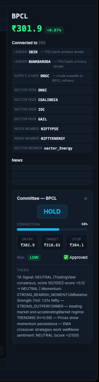
Click any stock node → "Run Committee" → ~60 seconds later you get a structured report with a conviction score, price levels, and the reasoning in plain English.
There's also a morning briefing — a script that runs at 9:15 AM IST every weekday, scans a watchlist, runs the committee on the top candidates, and sends a Telegram message with a "DO THIS TODAY" section.
The Stack
- Frontend: Next.js 15, D3.js v7, TypeScript — runs in Docker
- Backend: FastAPI (Python) serving graph data, live prices via yfinance, and the committee API
- Agents: Custom Python agents, each with a specific role and output schema
- Data: Relationship graph built from public knowledge (lending, index memberships, macro correlations) + live prices
- Infra: Runs locally, Dockerised, accessible over Tailscale
What's Next
- More relationship types — supply chain, promoter holdings, FII flow
- Better mobile experience
- Longer-term validation of the committee's picks
Sutra is still early. But it's already changed how I look at my portfolio — less "what price" and more "what's driving this, and why."